Template Locations #
Workshop Results Template
Standard Presentation Template
Borders
Need Help? #
The graphic design team at Intersect is always willing to help create new layouts, tighten up a rough deck or train you on how to best use the templates. Just ask.
Adding Client Logo #
When using a client logo, it should always be vector. No low-res logos or logos with white backgrounds allowed. So how do you get a great vector logo?
- Ask the client. More often than not, they have it and will share it early on in the project
- Use Vectorizer.ai and upload a raster version and have them vectorize it. (Some minimal cleanup may be required)
- Ask the design team to help!
- If the project isn’t for an organization, or there is no logo, remove the logo from the cover page and the border
Breakdown of common elements #
Master Pages #

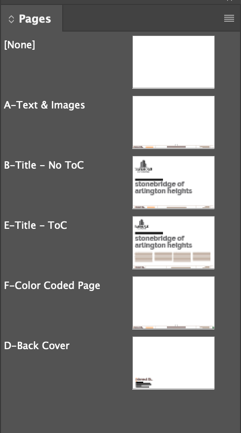
Each page should have a Master Page assigned;
A – Text and Images – This will be used for the majority of your pages. It includes the bottom border.
B – Title – No Table of Contents – This cover page should be used by any cover that doesn’t need a Table of Contents
C -Title – Table of Contents – This cover page should be used when a table of contents is needed.
D – Color Coded Page – This will replace your A Master Page if used in a document with color coded table of contents
E – Back Cover – Used as the last page of the presentation. Update with the proper contact information
Using Table of Contents Version
Creating the Logo in the border #

Often times, a client will have an icon as part of their visual identity. This is an obvious choice to use as their logo in the border.
Avoid using the full logo, as scaled down it will make type illegible. For inspiration visit the social pages of the company and get an idea for how they use their logo.
Creating grids #
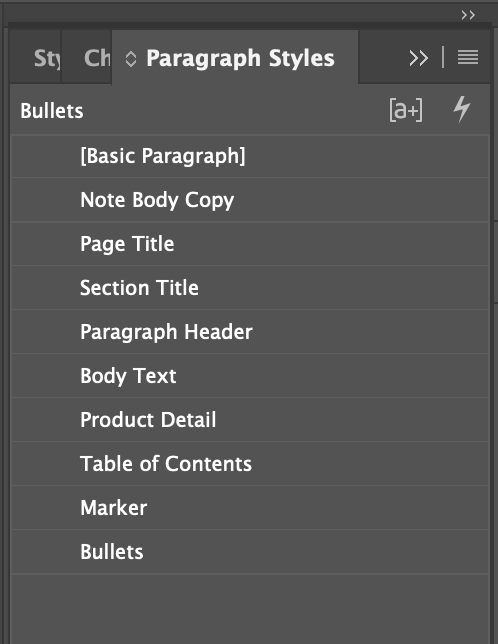
Paragraph Styles #

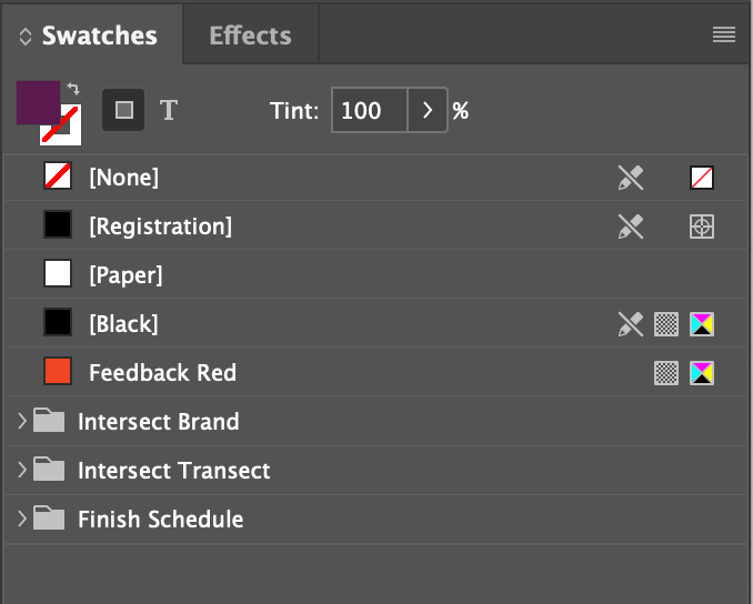
Color Palettes #

The Swatches panel contains folders with colors you might need.
